
Demo siteNot a real practice. A sample design for a research or evaluation consultant.
Wrenfield Research ConsultingGood research should feel human.
A site for a research and evaluation consultant. Most sites in that world are a wall of corporate blue, so I kept the classic palette and made it calm, editorial and warm.
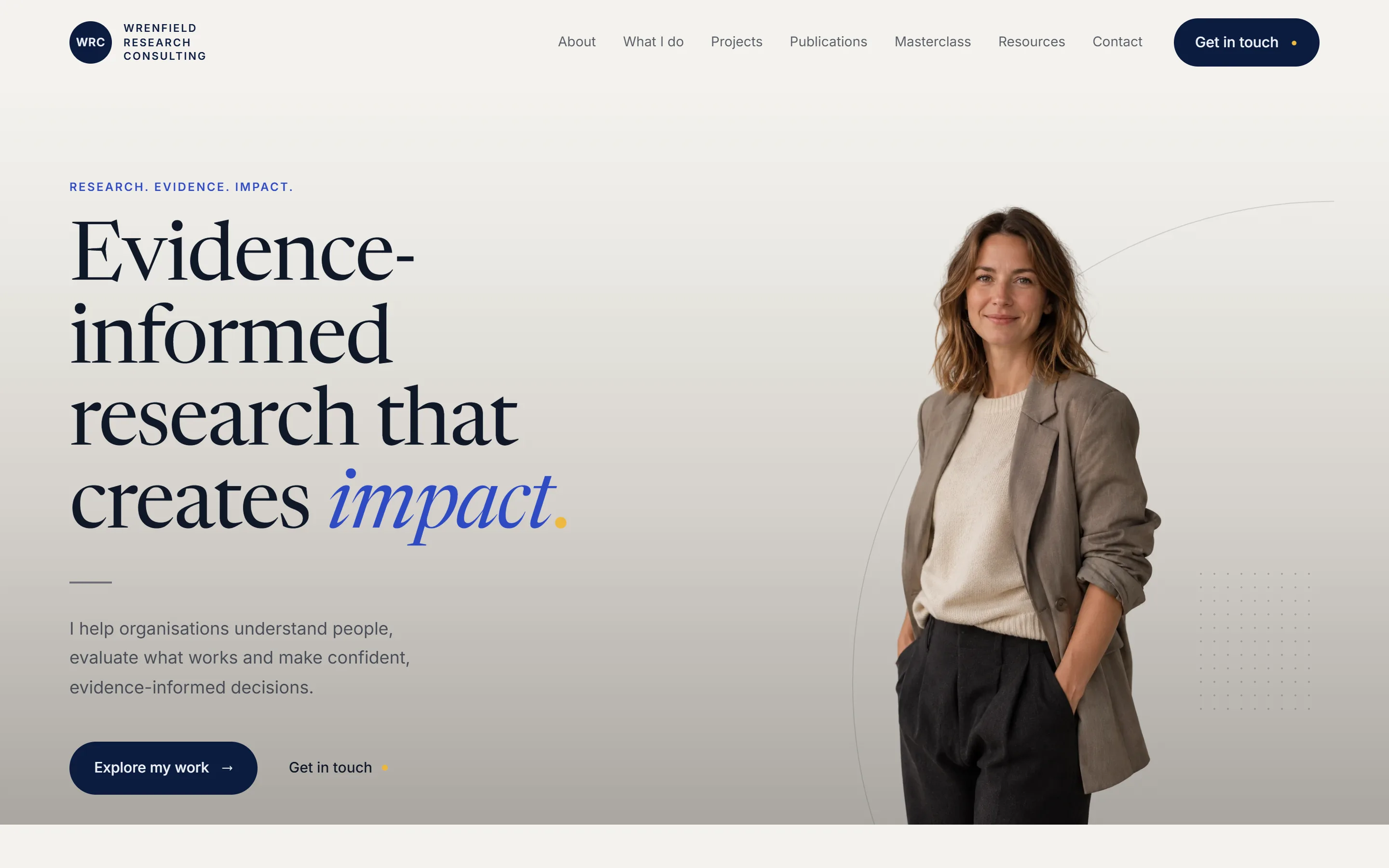
Editorial,
not corporate.
- What it is
- A sample website for a research or evaluation consultant
- What I did
- Design, build, the content structure
- Pages
- Home, About, What I do, Projects, Publications, Resources, Masterclass, Contact
- Built with
- Astro, Cloudflare
Twelve pages, one calm voice.
Home leads with what the consultant does and the work they've done. Four services open up one at a time. Each project has its own page. There's a corner for students, publications, resources, and a masterclass with its price on it.
Every word of the site lives in one file, so a consultant can change a service description without touching the layout.
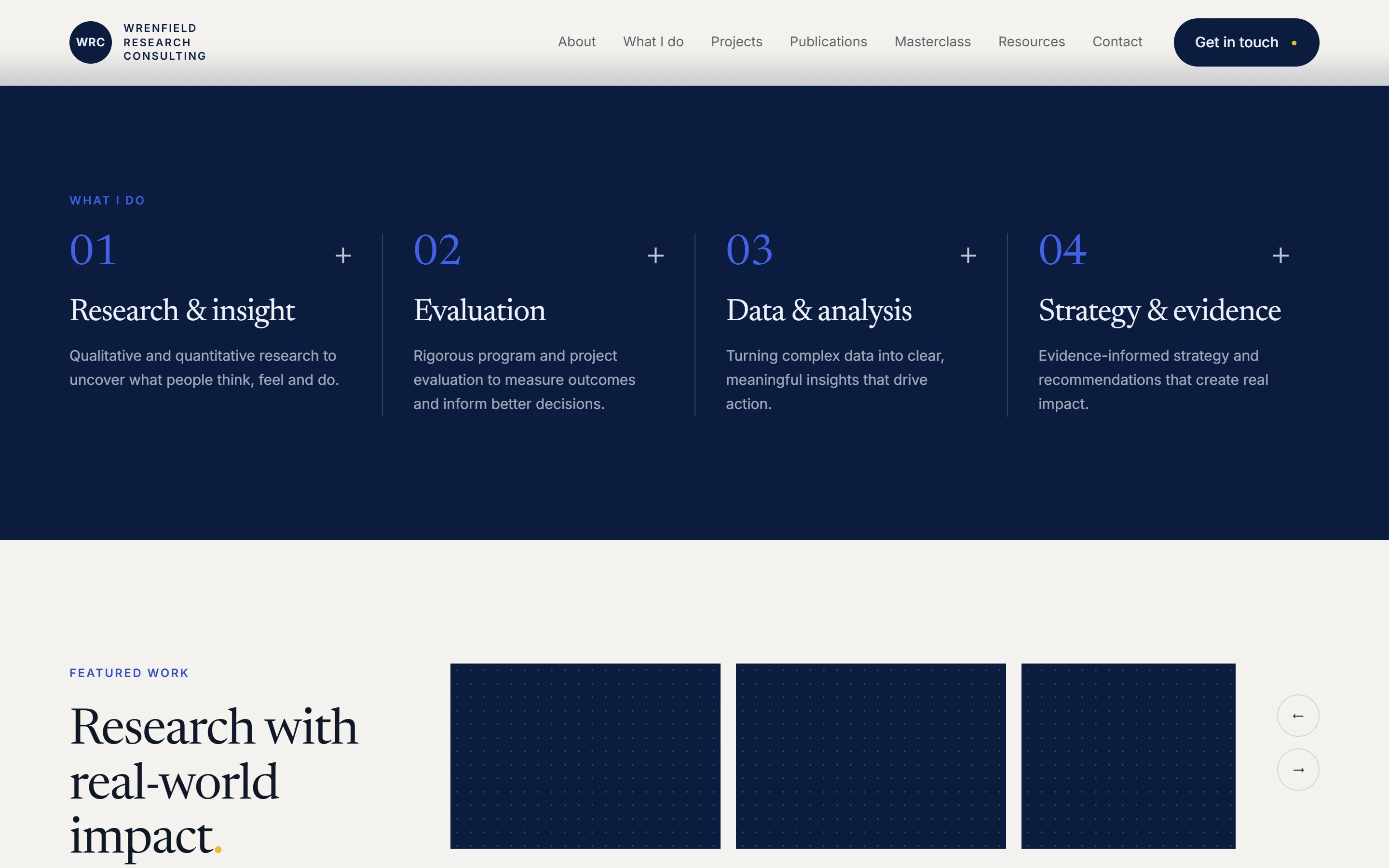
Professional services sell on trust.
The work before the credentials.
People hire a researcher because of what they've found out before. So the projects come before the qualifications.
Questions as headlines.
Projects lead with the question, not the client's name, like "What keeps volunteers coming back to a community garden?". A question is the one headline that makes people want the answer.
Never mistaken for a tutor.
A program manager landing here should never wonder for a second if they've found a tutoring service. Students get their own clearly marked corner.
Navy, but not too much.
Off-white sixty per cent, navy twenty-five, blue ten, a creamy yellow five. Let the navy creep past a quarter and it stops reading as light and starts reading like an agency slide deck.
A serif with warmth.
Newsreader for the headlines, the only place there's italic. Inter for everything you read. It feels like a journal, not a bank.
Quiet movement only.
The header grows a fine line once you scroll, and things fade in once. Nothing performs. The work does.
Sixty, twenty-five, ten, five.
The colours, in the proportions the whole site keeps to.
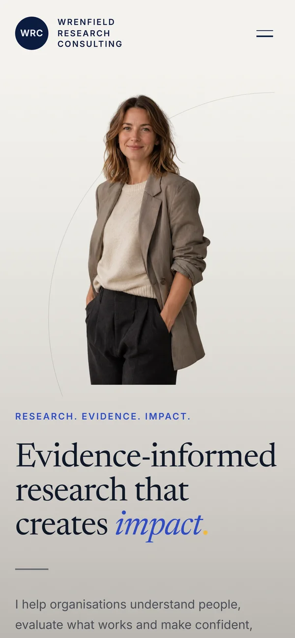
A person,
not a firm.
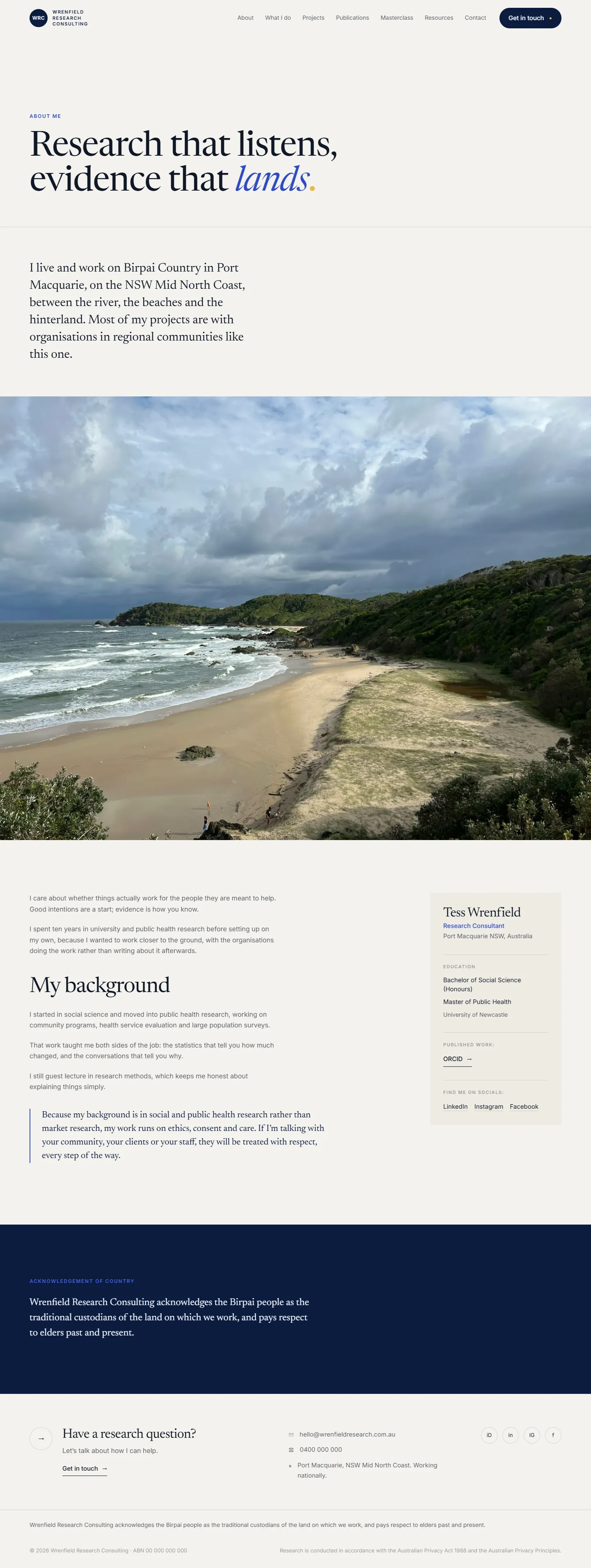
People hire a consultant because they trust one person. So the About page opens with where she lives and works, then a wide photo of the coast she works from, then her background in plain words.
A card beside the story answers who am I reading: name, role, qualifications and where to find her work, without anyone scrolling back up for it.
Hover the page to scroll through it.
What a consultant gets.
- A site that looks like the consultancy it is.Calm, considered and credible, the way good research is.
- The right people, straight away.Funders and program managers see research and evaluation first. Students find their own way in.
- Easy to keep current.All the words in one place, so new projects and publications go up without design work.
- Room to grow.Projects, publications, resources and a masterclass, each with a proper home.
Have a look around.
