
Demo siteNot a real venue. The opening screen of a design for a small film, food and events space.
The Back RoomFilm. Food. People. Culture.
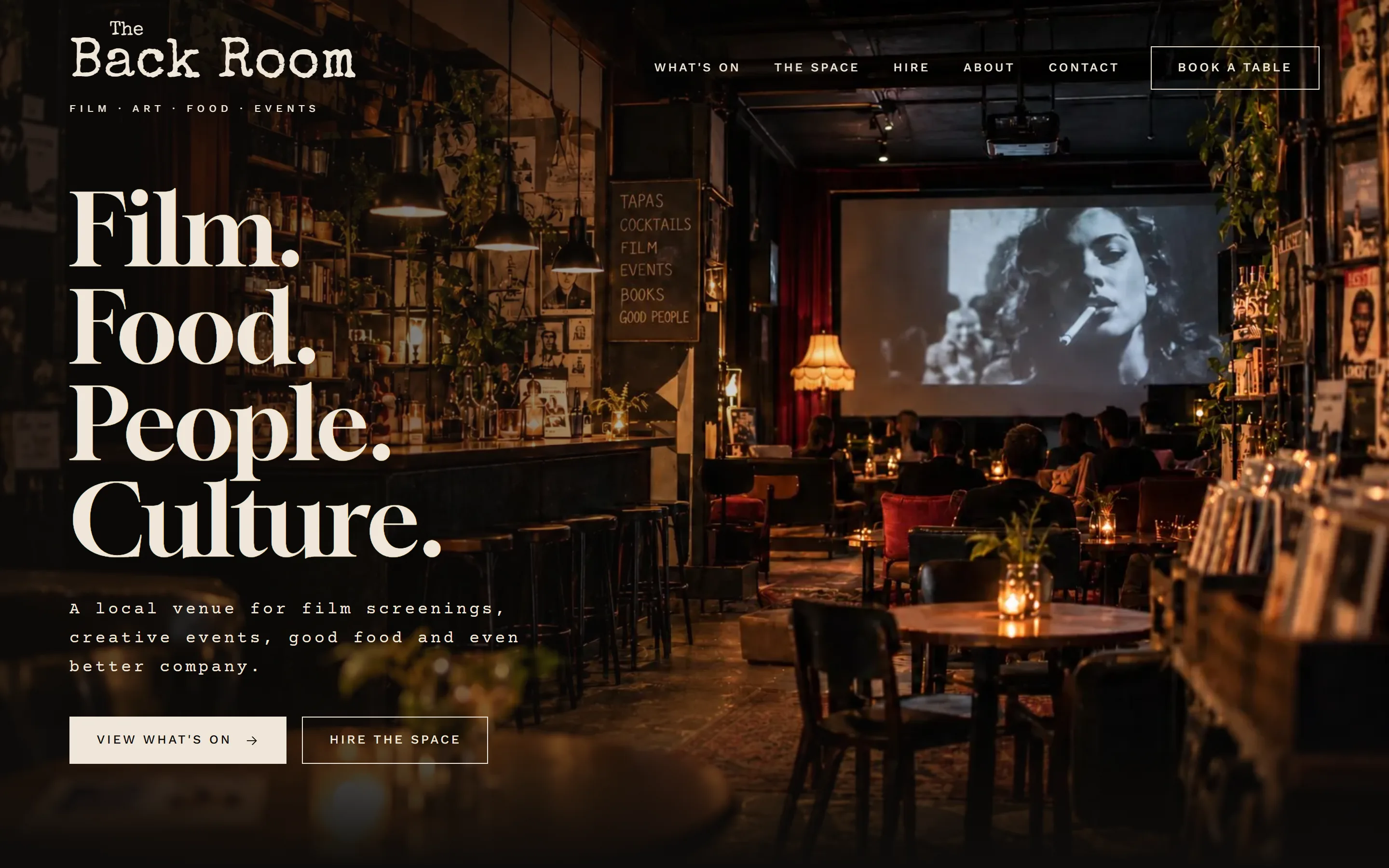
The opening screen of a site for a small venue. Everything someone needs to do is right there: see what's on, book a table, or hire the space.
Three things to do.
All on the first screen.
- What it is
- A sample design for a venue, café or bar with things on
- Built so far
- The opening screen and header
- What I did
- Design, build
- Built with
- Astro, Cloudflare
The first screen does the work.
A candlelit room, four words, and two clear choices: View what's on or Hire the space. A Book a table button sits in the header the whole way down.
The rest of the venue site, the listings, the space and the menu, comes next, when there's a real venue to build it around.
A venue site has one job: get people in.
Act from the first screen.
Most people come to a venue site to do one thing. All three of those things are right there, without scrolling.
A header that knows when to go.
It hides on the way down and comes back on the way up, and turns dark once it's off the photo so it's always readable.
Its own crop on a phone.
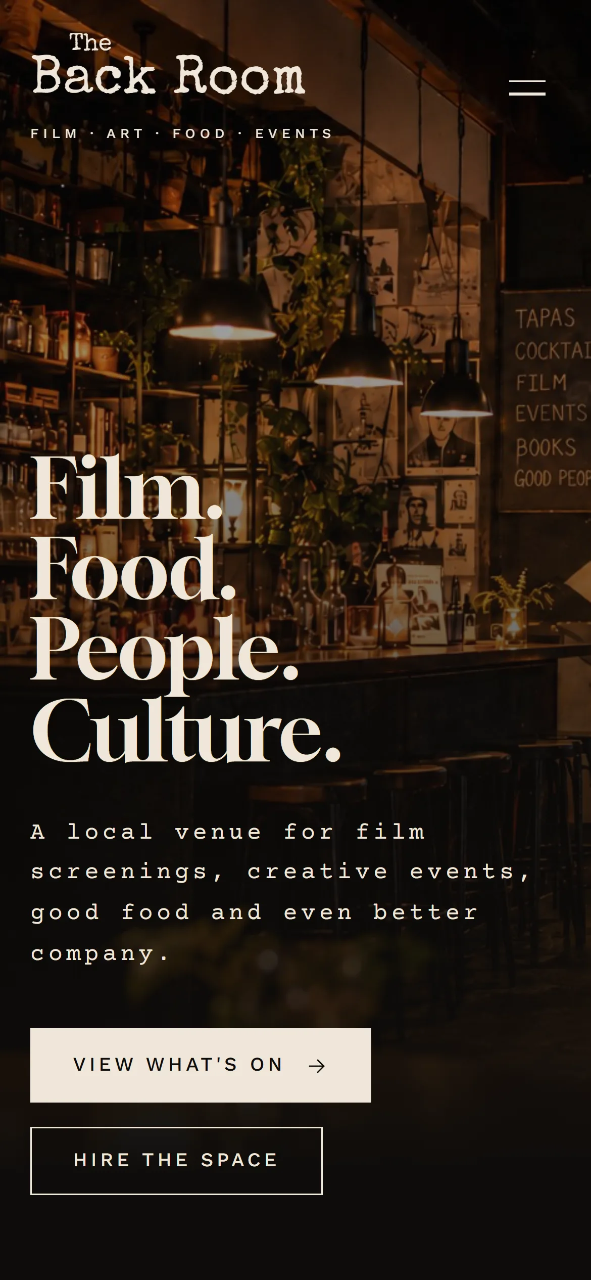
Phones get a separate cut of the photo, framed for a tall screen.
Nothing made up.
No invented crowd numbers, years or reviews. Listings are by night of the week, so a sample never shows a date that's passed.
Type with character.
Gloock for the headline, a typewriter face for labels, like a ticket stub. It feels like an old picture house.
What a venue gets.
- People do what they came to do.What's on, a table, or a hire enquiry, in one tap.
- Bookings go where you want.Your booking system, or an email if you don't have one.
- A look worth sharing.A first screen that feels like walking into the room.