
Demo siteNot a real poet. A sample design for a writer, with placeholder poems and words.
Elias PrattStories from the land.
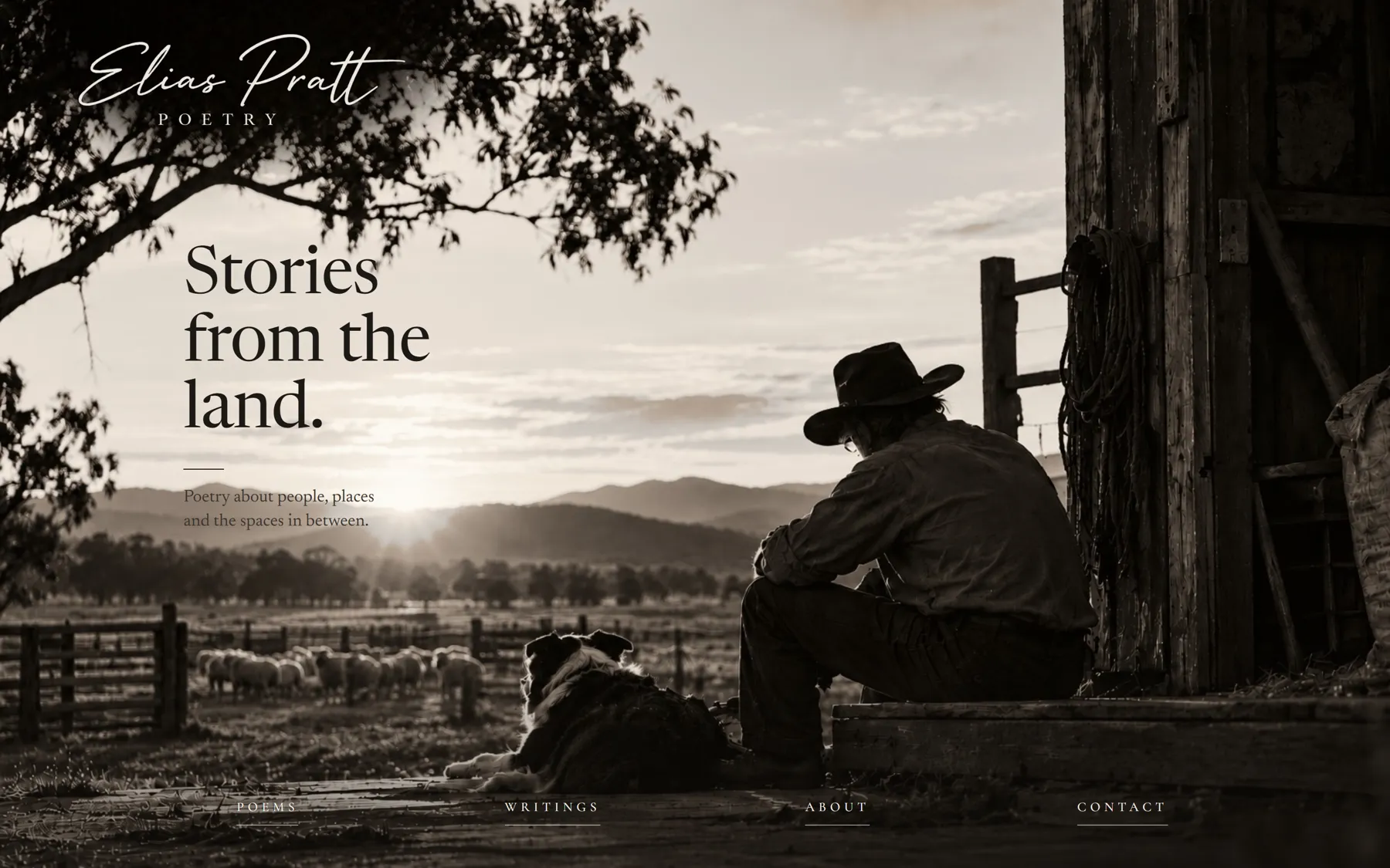
A site for a poet should read like a book, not a brochure. One photograph, his name in his own hand, and the words given room.
Read like a book.
Not a brochure.
- What it is
- A sample website for a poet or writer
- Sections
- Poems, Writings, About, Contact
- What I did
- Design, build, the photo work
- Built with
- HTML, CSS
One picture, then the words.
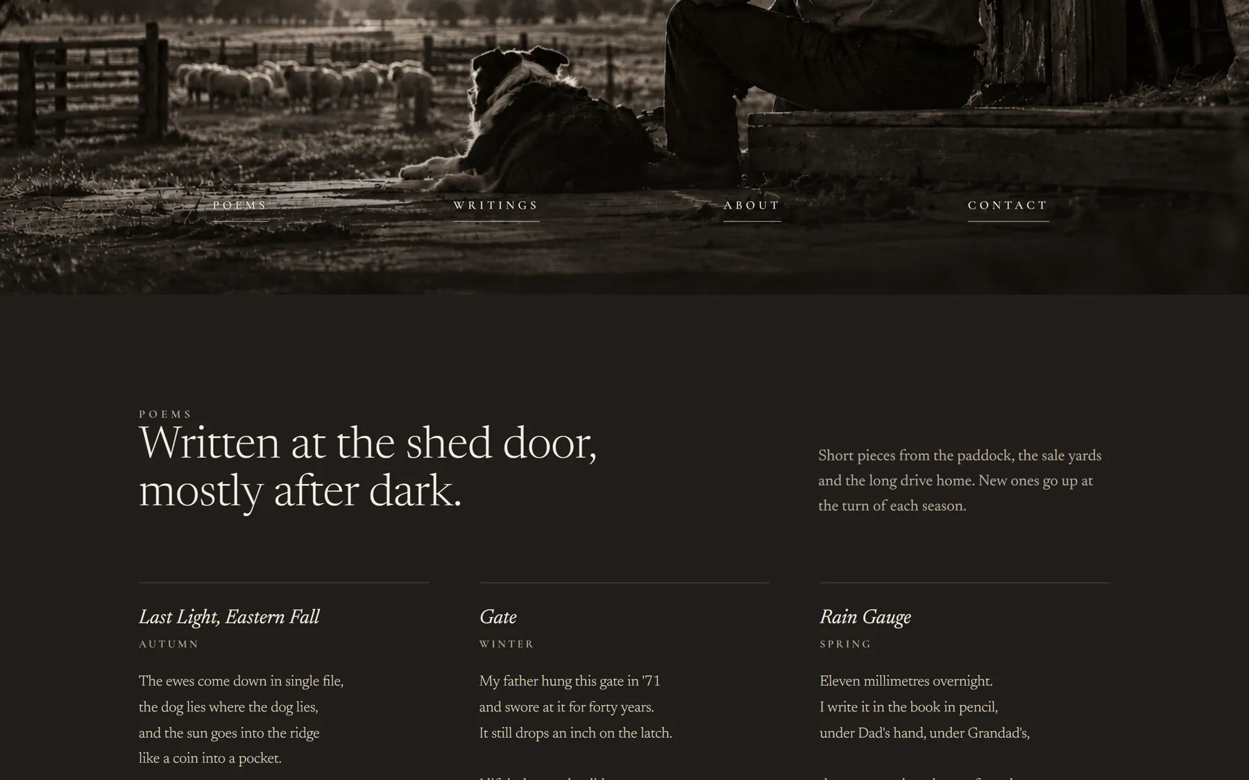
The opening is a single photograph at dusk, with the four links of the menu set down on the ground of the picture. Then short poems by season, longer essays from the district, his story and a way to ask about readings.
There's no menu bar along the top at all. The four words on the ground are the only menu the page needs.
Every choice serves the reading.
No bar across the top.
A menu bar would sit on the sky of the photo and make it a website. Setting the links on the ground keeps it a picture.
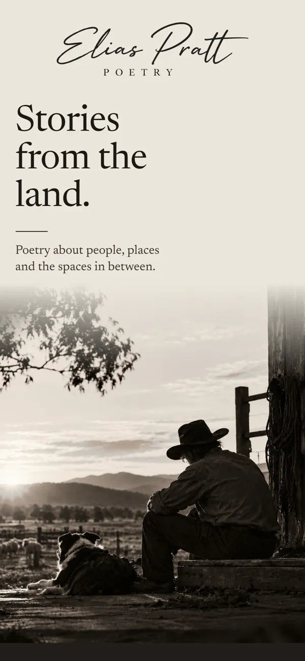
A phone gets its own layout.
A tall crop can't fit the headline and the man in the same sky. So on a phone the words sit on paper the colour of that sky, and the photo rises out of it.
His name in his own hand.
The signature is drawn artwork, not a script font, so it looks signed, not typed.
The photo, finished properly.
The trees behind the signature were thickened so the writing sits on shade, not bright sky.
Type for reading.
Newsreader for the poems and essays, with spaced capitals for the small labels. It sets like a printed collection.
What a writer gets.
- A home for the work.Poems and essays laid out to be read, not scrolled past.
- Readings and commissions.A clear, quiet way for halls, shows and festivals to get in touch.
- A site with a voice.It feels like the writing, which is the point.
Have a look around.
