
Live siteA real photographer. This is the site people use at clairevisual.com.au.
Claire LouiseA site that gets out of the way.
Claire's work is the whole point, so the site steps back and lets the photos carry it. And she can add new shoots herself, without calling me.
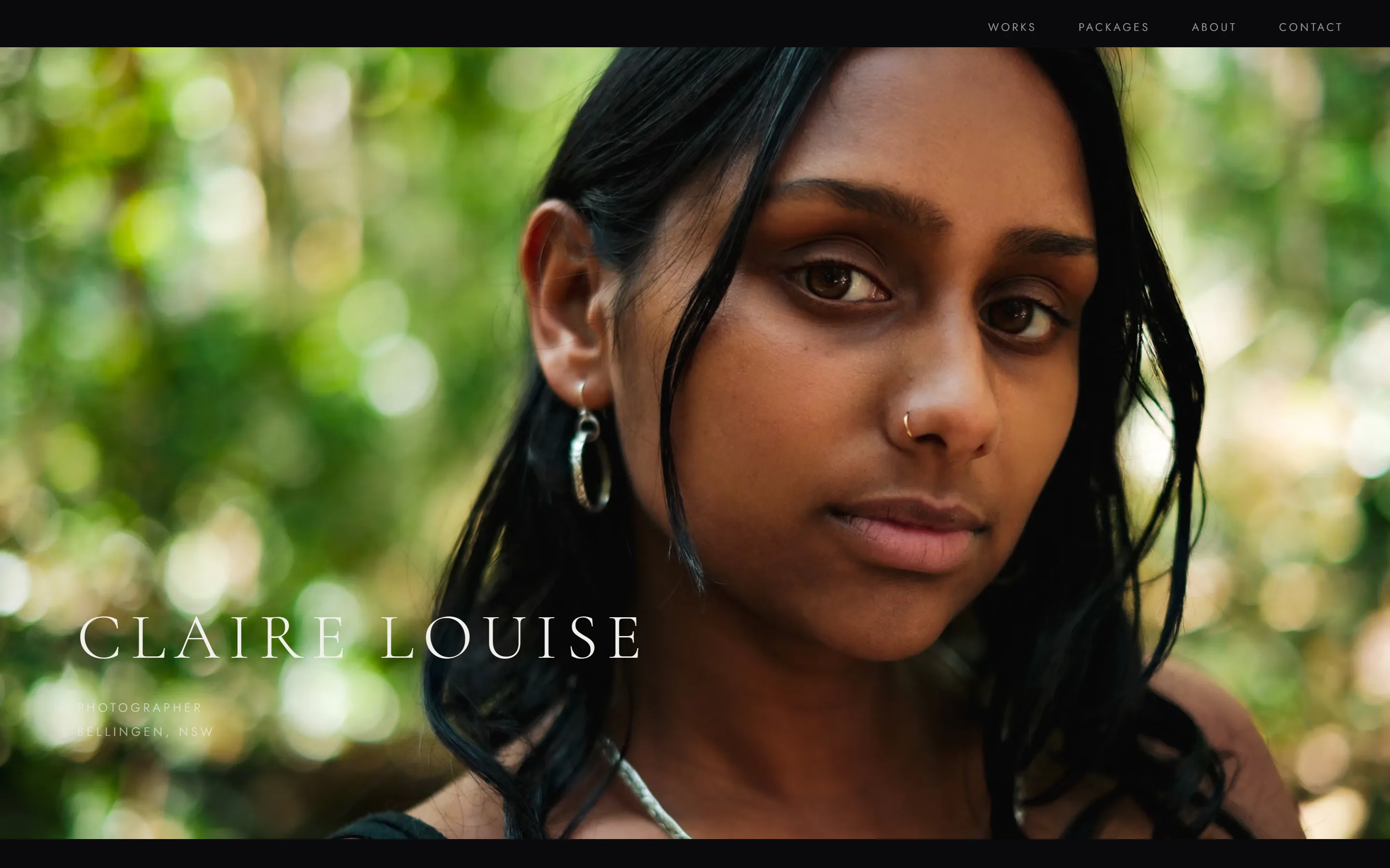
The photos lead.
Everything else follows.
- Client
- Claire Louise, photographer
- Where
- Bellingen NSW
- Built
- 2026
- What I did
- Design, build, and the dashboard she runs it from
- Built with
- Astro, Sanity, Cloudflare
- See it
- clairevisual.com.au ↗
Black, quiet, and full of pictures.
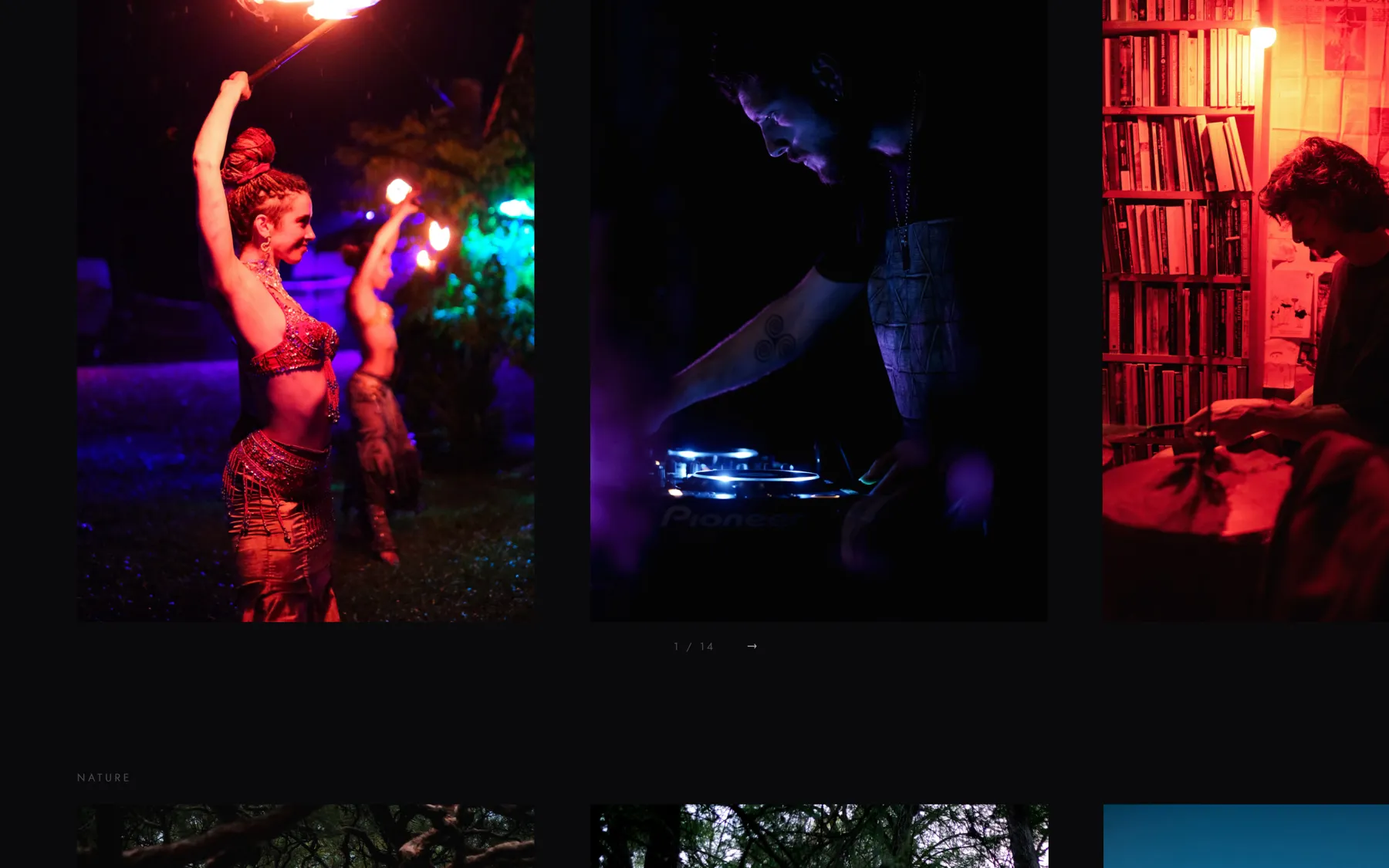
Her name opens the site over a full-screen photo, then fades and hands over to the header. From there it's her work: events, nature and portraits, each in a gallery you drag through, then her packages, her story and how to get in touch.
The last photo of each section dissolves as the next gallery slides in, so it reads like turning pages, not scrolling a feed.
A photographer is judged on the pictures. Nothing should compete.
Dark, so colour stays true.
A near-black page makes every photo glow and shows its colour honestly. Even the fades go to the page's own black, not to see-through, which can shift the midtones.
Full screen on a phone. Framed on a laptop.
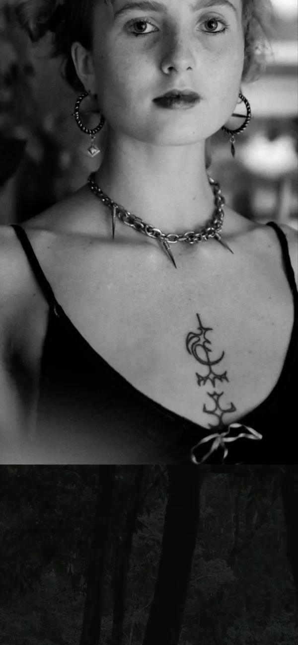
On a phone a photo can fill the screen. On a wide laptop, a full-screen tall portrait would cut off the subject's head, so there it gets a black margin instead.
Each photo lays itself out.
The site measures every picture. Wide ones fill the screen; tall ones are framed. Bright ones ease in from black so they don't jolt you. Nothing depends on how a file is named, so when Claire swaps a photo, it just works.
She sets the order.
The galleries run in the order she chooses. A photographer sequences her work on purpose, so the site never shuffles it.
Smooth, even on an old phone.
All the movement runs in one loop and only touches what a phone can animate cheaply, so it stays smooth on a budget phone.
Two typefaces, very quiet.
Cormorant Garamond for her name and the headings, Jost for everything else, both small and spaced out so they never fight the pictures.
The photo decides.
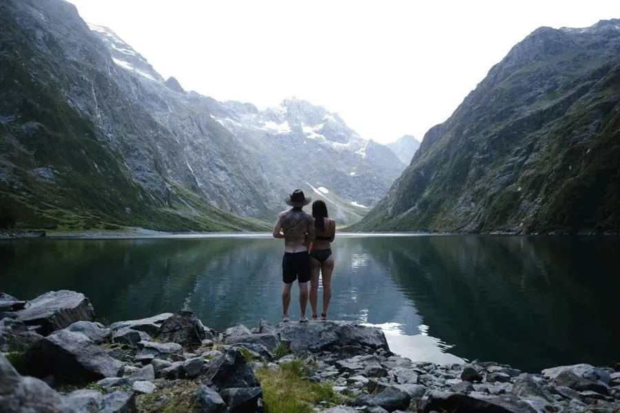
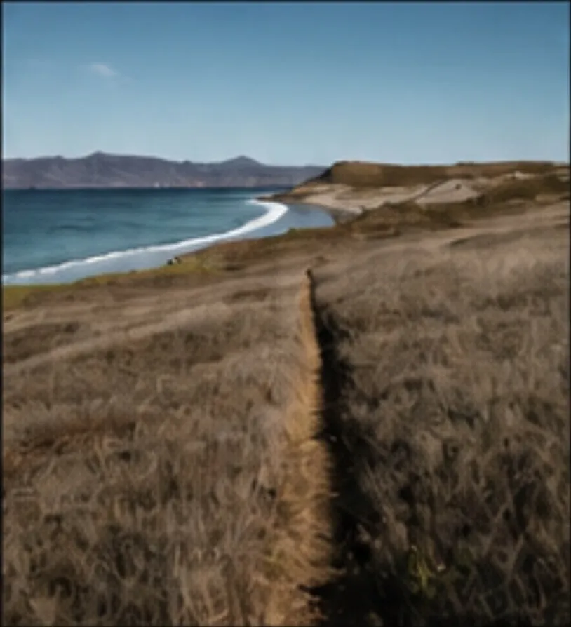
These are three of Claire's photos. This page is measuring them right now, the same way her site does: how wide each one is, and how bright.
- Shape
- …
- Brightness
- …
- Shape
- …
- Brightness
- …

- Shape
- …
- Brightness
- …
New shoot to live in under a minute.
Claire uploads and orders her photos and packages from her own dashboard. She hits publish, the site rebuilds itself, and the change is on her live site in about 45 seconds.

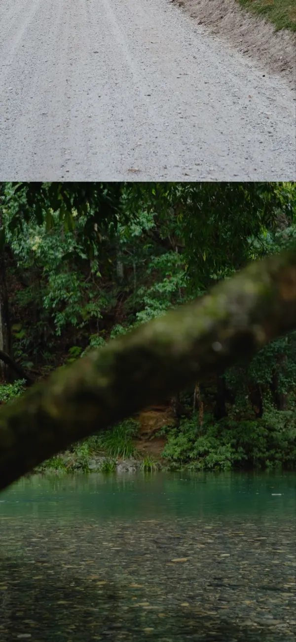
What Claire gets.
- Her work, shown at its best.Every photo framed to suit its own shape and brightness, on a page dark enough to make it glow.
- She runs it herself.New shoots, galleries and packages go up from her dashboard, live in under a minute.
- Nothing breaks when she changes things.Because the layout comes from the photos themselves, swapping a picture can't put it in the wrong place.
- A site that works on every screen.Full screen on phones, framed on laptops, smooth on both.
Have a look around.
